

PHOTOGRAPHY
Cora’s Cookies
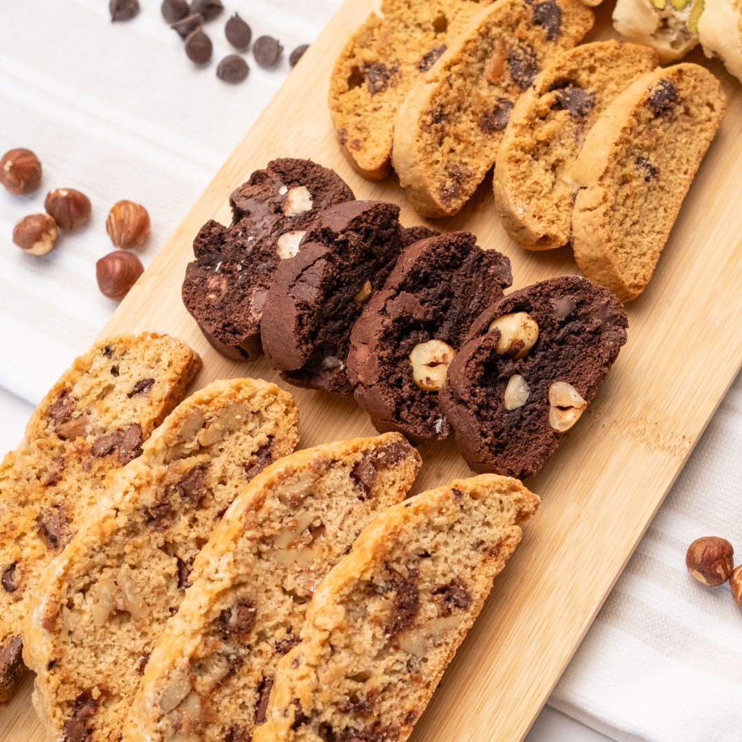
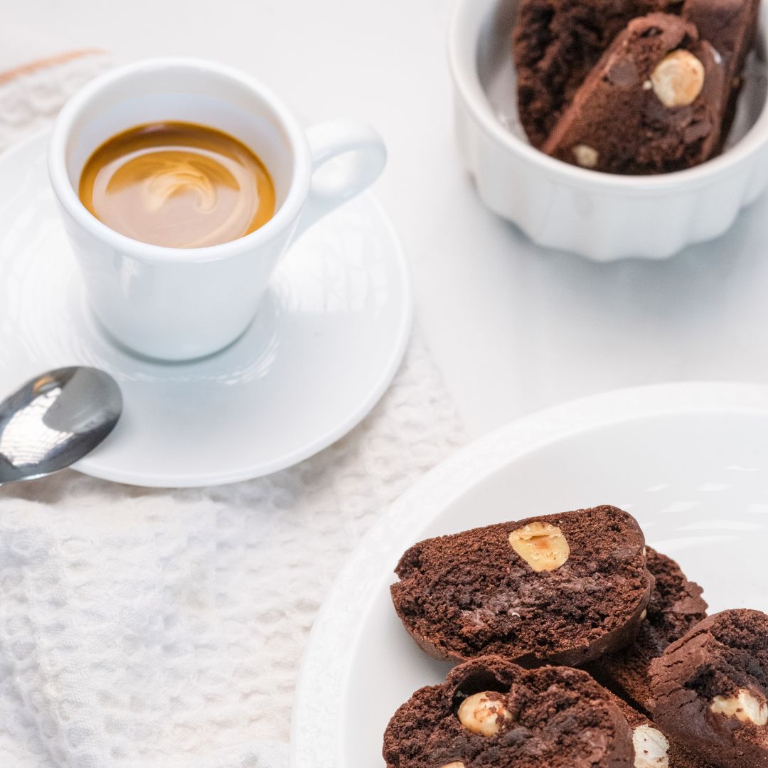
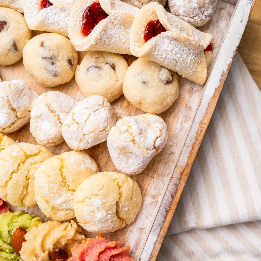
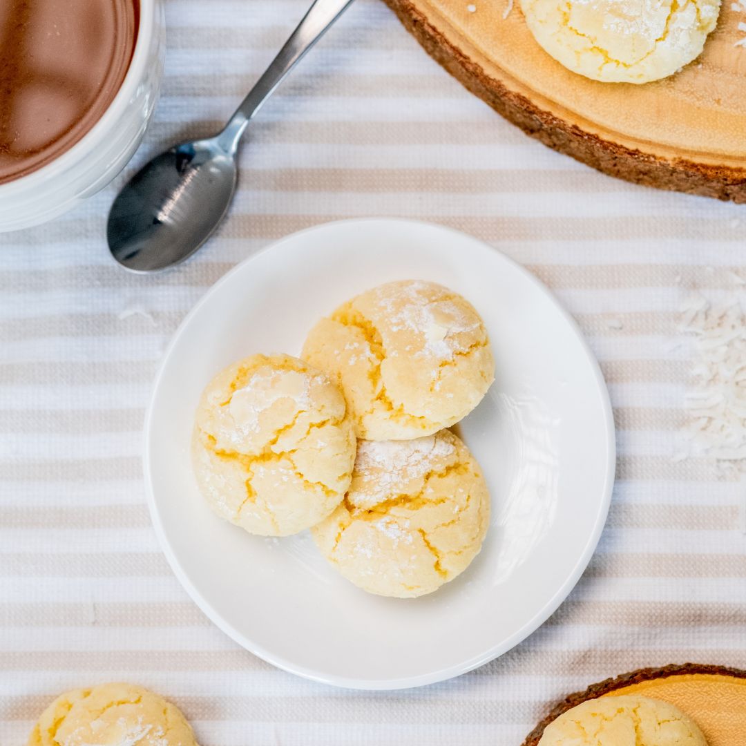
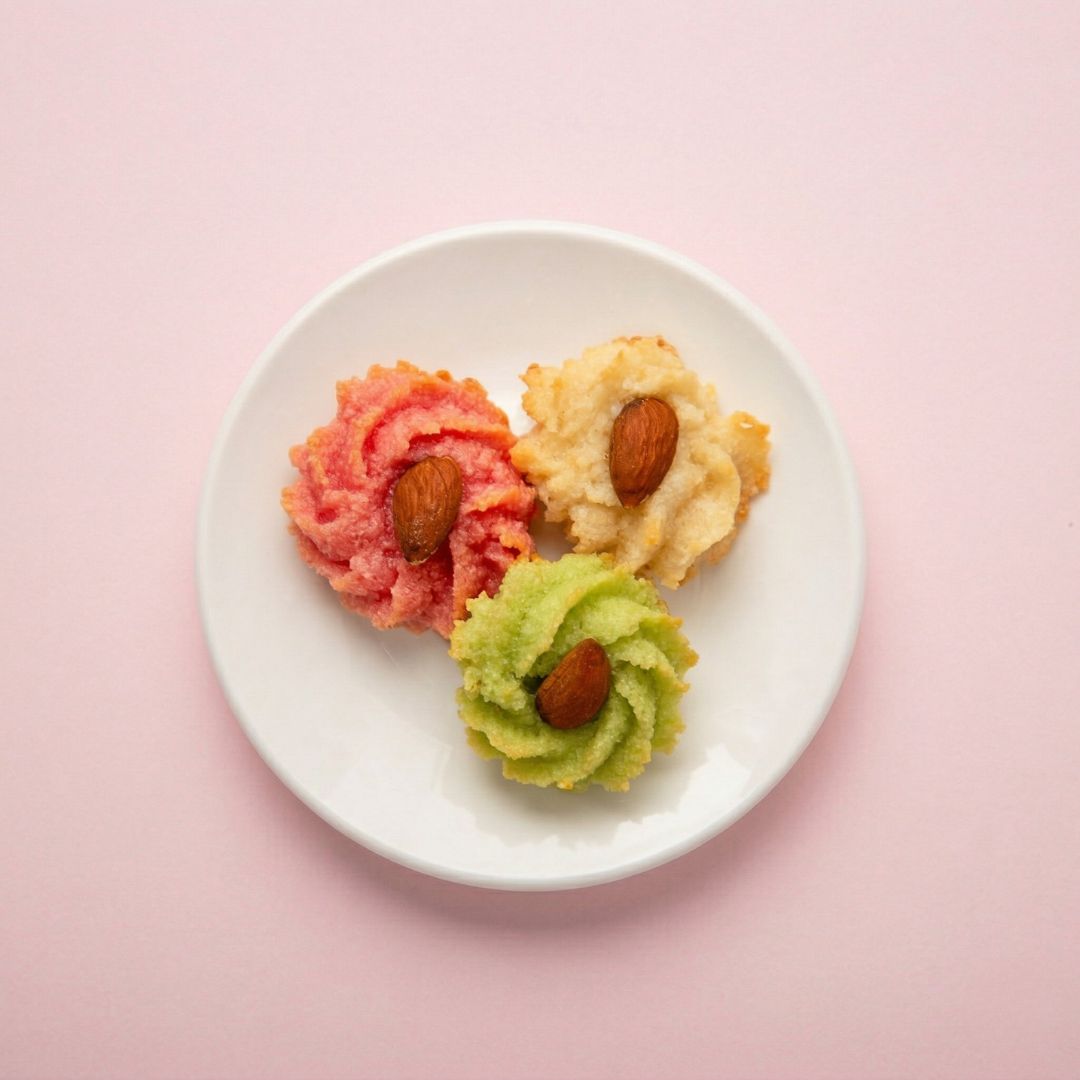
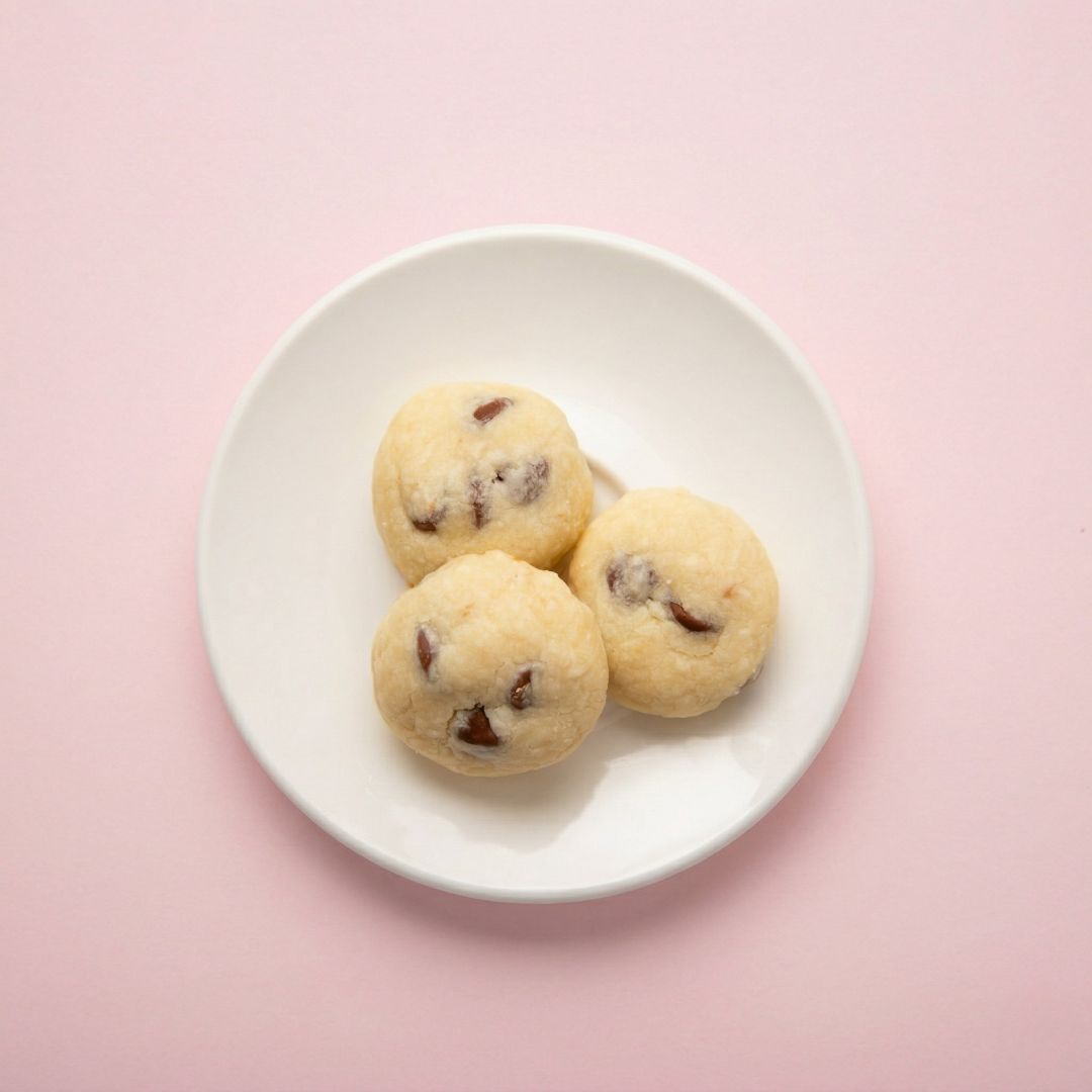
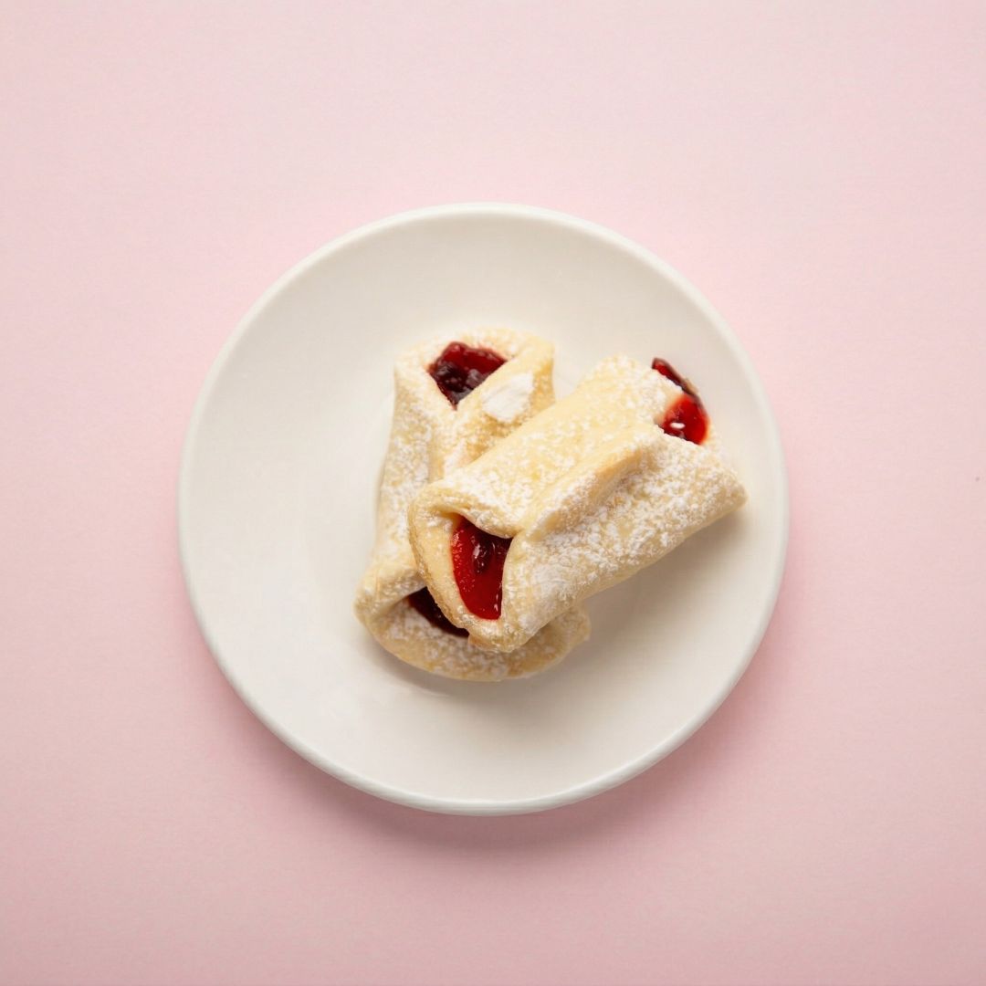
To showcase Cora’s Cookies properly, the photography had to look as good as the cookies taste. We captured the beauty and quality of each treat with images that are both inviting and on-brand, from rich and styled lifestyle shots to clean, simple product photos that highlight the cookies themselves.

DIGITAL & BRAND IDENTITY
SWEET ITALIAN TRADITION
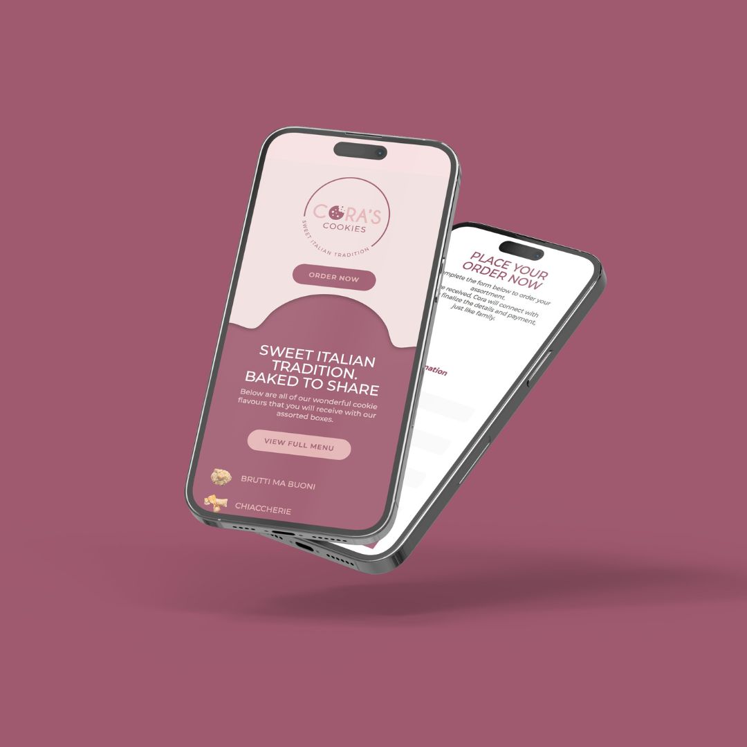
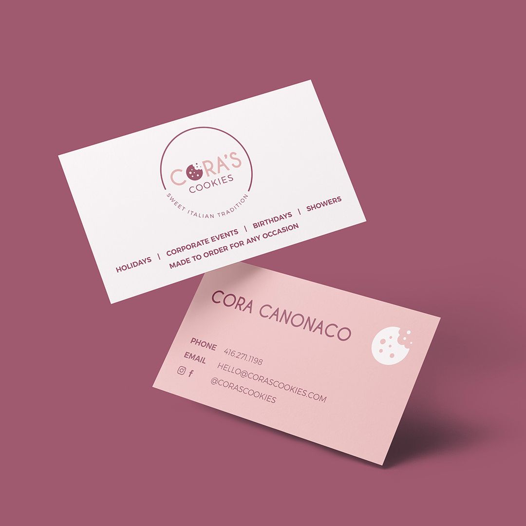
We developed a cohesive brand identity that reflects the warmth and authenticity of Cora’s Cookies. A clean, mobile-friendly landing page paired with thoughtful brand materials ensures the experience feels consistent wherever customers discover the Cora’s Cookies brand. From browsing cookie flavours online to connecting with the business directly, every touchpoint reinforces the same message. Traditional recipes, beautifully presented and ready to share.

CASE STUDY
The Story Behind The Brand
Cora’s Cookies needed a brand presence that matched the quality of what they were selling: traditional, Italian-inspired treats that deserved more than generic bakery branding and phone-camera product shots.
Our approach was to build a brand identity around the warmth and authenticity of the recipes themselves, then pair it with photography that made each cookie look as good as it tastes, from styled lifestyle shots to clean product photography. A mobile-friendly landing page brought it all together, so customers get the same experience whether they are browsing flavours online or hearing about Cora’s Cookies from a friend.
The result is a cohesive brand from photography to web presence, where every touchpoint reinforces the same message: traditional recipes, beautifully presented and ready to share.